
Add a trendline to your chart to show visual data trends.
Add a trendline
- Select a chart.
- Select the + to the top right of the chart.
Select Trendline.
Note: Excel displays the Trendline option only if you select a chart that has more than one data series without selecting a data series.
- In the Add Trendline dialog box, select any data series options you want, and click OK.
Format a trendline
- Click anywhere in the chart.
- On the Format tab, in the Current Selection group, select the trendline option in the dropdown list.
- Click Format Selection.
- In the Format Trendline pane, select a Trendline Option to choose the trendline you want for your chart. Formatting a trendline is a statistical way to measure data:
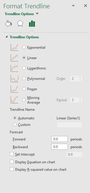
- Set a value in the Forward and Backward fields to project your data into the future.
Add a moving average line
You can format your trendline to a moving average line.
- Click anywhere in the chart.
- On the Format tab, in the Current Selection group, select the trendline option in the dropdown list.
- Click Format Selection.
In the Format Trendline pane, under Trendline Options, select Moving Average. Specify the points if necessary.
Note: The number of points in a moving average trendline equals the total number of points in the series less the number that you specify for the period.
Comments
0 comments
Please sign in to leave a comment.